
Ever felt like your Jira board is hiding something from you?
You’ve got sprints planned, stories scoped, and your backlog looks clean, until… suddenly, something’s blocked, and no one knows why. Welcome to the world of invisible dependencies. The silent killers of velocity. (and happy teams)
This is the guide for you.
We’re diving into Jira dependency graphs, visual reporting, and the tools that make tangled workflows actually make sense. Whether you’re an agile squad lead, a PMO wrangler, or just tired of being surprised by blockers, you’ll find what you need right here.
Let’s turn your Jira from “Looks fine to me” to “Now I see exactly what’s holding us back.”
In Jira, a dependency represents a relationship between two issues where the progress or outcome of one task relies on another. For example, a developer can’t start a feature until the UI is designed. These relationships can exist within a single project or across multiple teams and epics.
Dependencies are typically defined using Jira’s issue linking feature. You can create links such as:
“blocks” / “is blocked by”
“relates to”
“is duplicated by” / “duplicates”
These links form the foundation of how dependencies are tracked and visualised in Jira.
Jira supports a wide range of issue link types that define how tasks relate to one another. These links help you map dependencies, trace accountability, and build visual representations of how work flows through your teams.
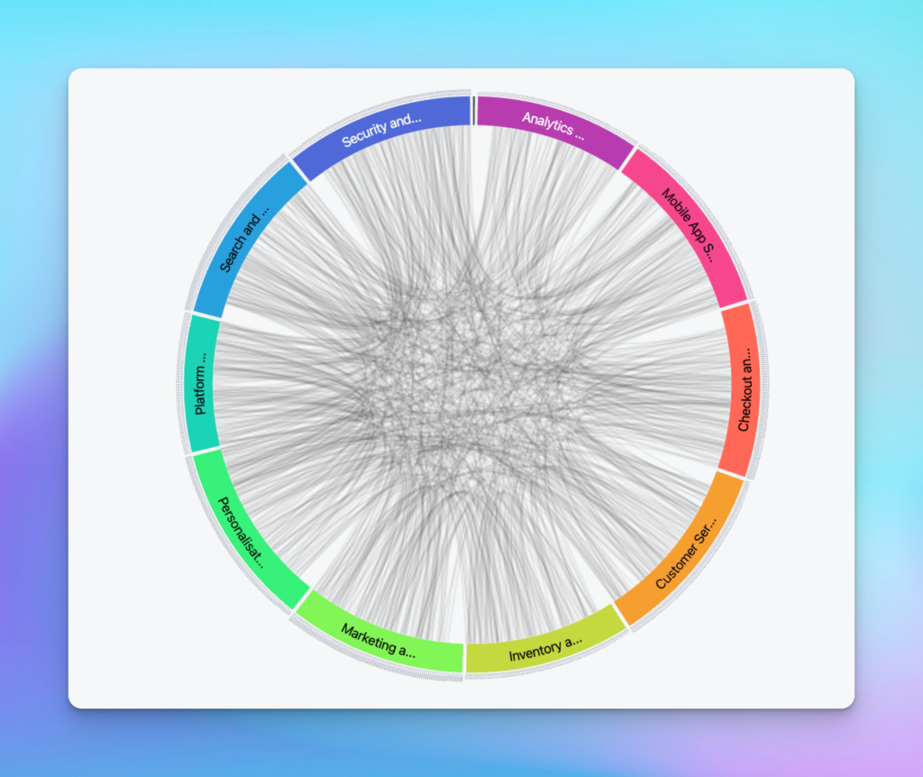
An example of a grouped dependency graph
Here are the most common types of Jira issue links:
blocks / is blocked by – Used when one issue prevents another from starting or completing.
causes / is caused by – Shows a direct cause-effect relationship between issues (e.g., a bug caused by a code change).
implements / is implemented by – Connects delivery work (e.g., stories or tasks) to requirements or specs.
relates to – A non-hierarchical, non-blocking association between two issues that are contextually linked.
added to idea – Shows that an issue contributes to the development or exploration of an idea.
merged into / merged from – Indicates that two or more issues have been consolidated into one.
clones / is cloned by – Marks issues that have been duplicated for use in a different project or context.
duplicates / is duplicated by – Highlights redundant issues that represent the same piece of work.
reviews / is reviewed by – Captures dependencies around code reviews, content approvals, or sign-offs.
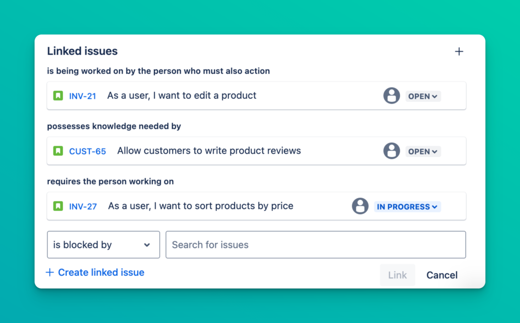
what Jira issue links look like in Jira
These links don’t just help Jira “understand” your work—they help your team understand how work is connected, where delays may happen, and what needs to happen first.
Ignoring dependencies can derail even the best planned project. Here’s why they’re critical:
Visibility – Teams can see how their work affects others and plan accordingly
Risk Management – Blockers and delays become visible before they cause damage
Prioritization – Work can be ordered based on what’s needed upstream or downstream
Delivery Confidence – Stakeholders gain confidence when dependencies are known and managed
By turning invisible dependencies into clear visual graphs, reports or visualizations, you give your team the information they need to deliver to the plan and with confidence.
Seeing is understanding. When your team is working across multiple issues, epics, and projects, dependencies often exist—but stay hidden. Visualizing them changes everything. It turns a tangle of tasks into a clear, navigable map of how work gets done.
 Dependencies can cause severe headaches. Mapping them and visualizing them can help.
Here’s why visualizing dependencies matters so much:
When dependencies are visualized, you no longer need to click into individual issues or dig through comments to understand which Jira items are connected. A graph or visual map shows relationships in real-time – across teams, sprints, and timelines. You can instantly identify which pieces of work are linked, which are independent, and where delays could have a ripple effect.
Dependency graphs make blockers obvious. Instead of finding out too late that a high-priority story is stalled by an unstarted subtask, your team can act early—reallocate, unblock, or adjust the timeline. This proactive insight can save sprints, launches, and team morale.
With visualization, your project stops being a list and becomes a flow. You can see the critical path, track work from idea to implementation, and explain progress to stakeholders without the jargon. It simplifies planning, aligns teams, and creates shared clarity.
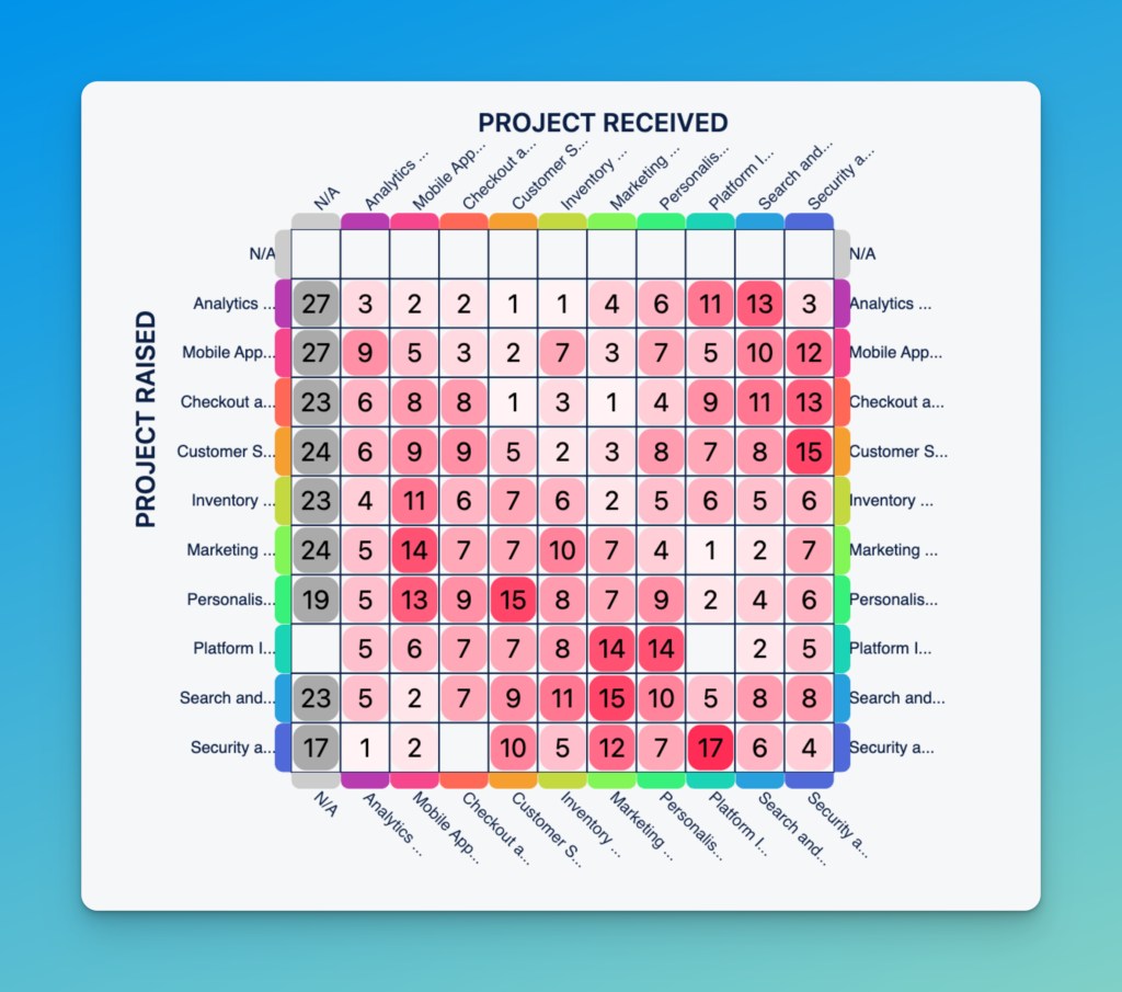
An example of a dependency matrix from the Dependency Mapper for Jira app available on the Atlassian Marketplace
In short: visualizing dependencies doesn’t just make Jira prettier—it makes delivery smarter, more transparent, and more predictable.
Jira offers a few native options for viewing dependencies—especially through issue links and standard boards. These built-in tools can be helpful for small teams or simple projects, but they come with limitations you’ll quickly feel as things scale.
At its core, Jira tracks dependencies through issue links. When you link issues using types like “blocks,” “relates to,” or “is caused by,” Jira will display those connections in each issue’s detail view under the “Issue Links” section.
You can also:
Hover over links to get a quick preview of related issues
Use the Dependency badge in Advanced Roadmaps (Jira Premium)
Show dependencies between issues in Advanced Roadmaps timelines
Use JQL (Jira Query Language) to search for linked issues
Note: While JQL is the most customizable option for searching for linked issues, it also comes with limitations. For example, the linked issues are very difficult to natively export when using JQL search results.
For simple use cases, this might be enough. But these views are still mostly text-based—not visual. You’re looking at lists, not maps.
While Jira does track dependencies, it doesn’t truly visualize them out of the box. You’ll quickly run into challenges like:
No built-in dependency graph or network view
Hard to visualize cross-project or multi-team dependencies
Limited filtering or grouping by link type
No way to visually identify the critical path
Requires a lot of manual clicking and context-switching
At Quirk, we hear from Jira Plans users that it can be unfriendly for non-Jira power users (stakeholders, non-tech, senior leaders) which often kicks off the discussion to seek alternative solutions. Jira Plans also lacks flexibility to configure different link types, forcing teams to manually change all their dependency types from scratch. Visualizations of dependencies only work if you are able to action them with affected teams. So it’s crucial that they are able to access and engage with the same information that you can. (without a college degree to decipher the results)
Even Advanced Roadmaps (in Jira Premium) provides only basic arrows between issues on a timeline, but it’s far from a full dependency graph.
If your team is:
Managing complex cross-team projects or shared services teams building for other teams
Practicing SAFe or large-scale agile
Running into bottlenecks and blockers regularly
Needs to see real-time dependency visualizations for spring planning, stand-ups or retrospectives
…then native Jira tools probably won’t cut it. This is where Atlassian marketplace apps step in—offering powerful visual graphs, dynamic filters, and scalable reporting that native Jira simply doesn’t provide.

🧭 Dependency Mapper for Jira – by Quirk
Built by the same team that coaches and consults with Jira enterprise customers, Dependency Mapper is designed for simplicity, speed, and clarity. It plugs directly into your existing issues and renders clean, interactive dependency maps without any fuss.
Highlights:
Visualize issue links as real-time graphs
Filter by project, epic, sprint, or link type
Filter by assignee and team
See blockers and critical paths at a glance
Works across classic and next-gen projects
Built and supported by the Quirk team who are experts in Dependencies and Agile
With our actionable reports, we’ll pinpoint any outstanding blockages that need to be taken care of immediately. And for those who are looking to forecast potential roadblocks in your delivery – you’re covered too!
Dependency Mapper for Jira is available on Cloud or Data Center on a free trial for 30 days.
Ideal for: Teams who want visual clarity without complexity.
Structure creates a spreadsheet-style hierarchy of issues—good for program managers who love control and configurability. With the additional paid add-ons of Gantt and Structure.Pages, it can display dependencies as timelines or custom views.
Highlights:
Build custom issue hierarchies
View and edit dependencies in grid or Gantt view
Highly flexible (but has a learning curve)
Supports roll-ups and advanced formulas
Ideal for: PMOs and teams managing multiple projects who want a grid display of their issues.
BigPicture is a full-scale project portfolio management suite. It offers powerful visual tools like Gantt charts, program boards, and risk matrices, all integrated with Jira issues. Dependencies are visualised as arrows between tasks.
Highlights:
Visual program boards with SAFe support
Drag-and-drop Gantt chart with dependency arrows
Manage risks, objectives, and teams in one place
Sync with external calendars and workloads
Ideal for: Enterprises running complex, multi-tier delivery frameworks.
Included with Jira Premium, Advanced Roadmaps offers timeline-based planning across multiple teams and projects. It allows teams to define and view dependencies across a roadmap.
Highlights:
Visualize dependencies on a timeline view
Set issue hierarchy levels (Initiative > Epic > Story)
Shared team planning and capacity tools
Ideal for: Teams already on Jira Premium who would like to build a roadmap
For Agile and SAFe teams, dependencies aren’t just a technical detail—they’re a core delivery risk. If one team’s story is blocked by another team’s deliverable, and that relationship isn’t surfaced, your sprint plan, PI objective, or release milestone is at risk.
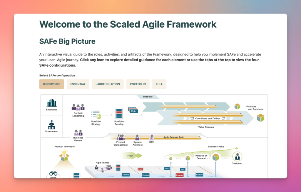
Scaled Agile Framework
That’s why dependency visualization is critical in scaled delivery frameworks. It supports alignment, risk mitigation, and faster decision-making across squads and programs.
In SAFe environments, Program Increment (PI) planning is where cross-team coordination lives or dies. Dependency mapping enables:
Program Boards that show which teams depend on each other
Milestone tracking for shared deliverables
Blocker visibility across features, enablers, and epics
Tools like BigPicture and Advanced Roadmaps support this to varying degrees—but if you want lightweight, focused clarity, Dependency Mapper for Jira by Quirk is built specifically for this need.
With Dependency Mapper, you can:
Filter your dependency graph by PI, team, assignee, label, or sprint
See arrows between issues that represent blockers, relationships, or implementation links
Colour-code dependencies to distinguish types (e.g. “blocks,” “implements,” “is reviewed by”)
Zoom in on features or initiatives to isolate risk areas
It’s perfect for PI planning sessions – whether you’re in the room or fully remote.
Agile at scale means one team’s “Done” is often another team’s “Ready to Start.” Without a visual layer, these handoffs create confusion, delays, and finger-pointing.
Dependency Mapper gives you a clear, filterable map of:
Which teams are blocked and by whom
What deliverables are being waited on across epics or initiatives
Where to intervene to keep a PI on track
It works across classic and next-gen Jira projects and integrates seamlessly with existing issue links—no custom fields or configuration headaches.
For more on features like live filtering, critical path highlighting, and graph sharing, check the full Dependency Mapper documentation here →
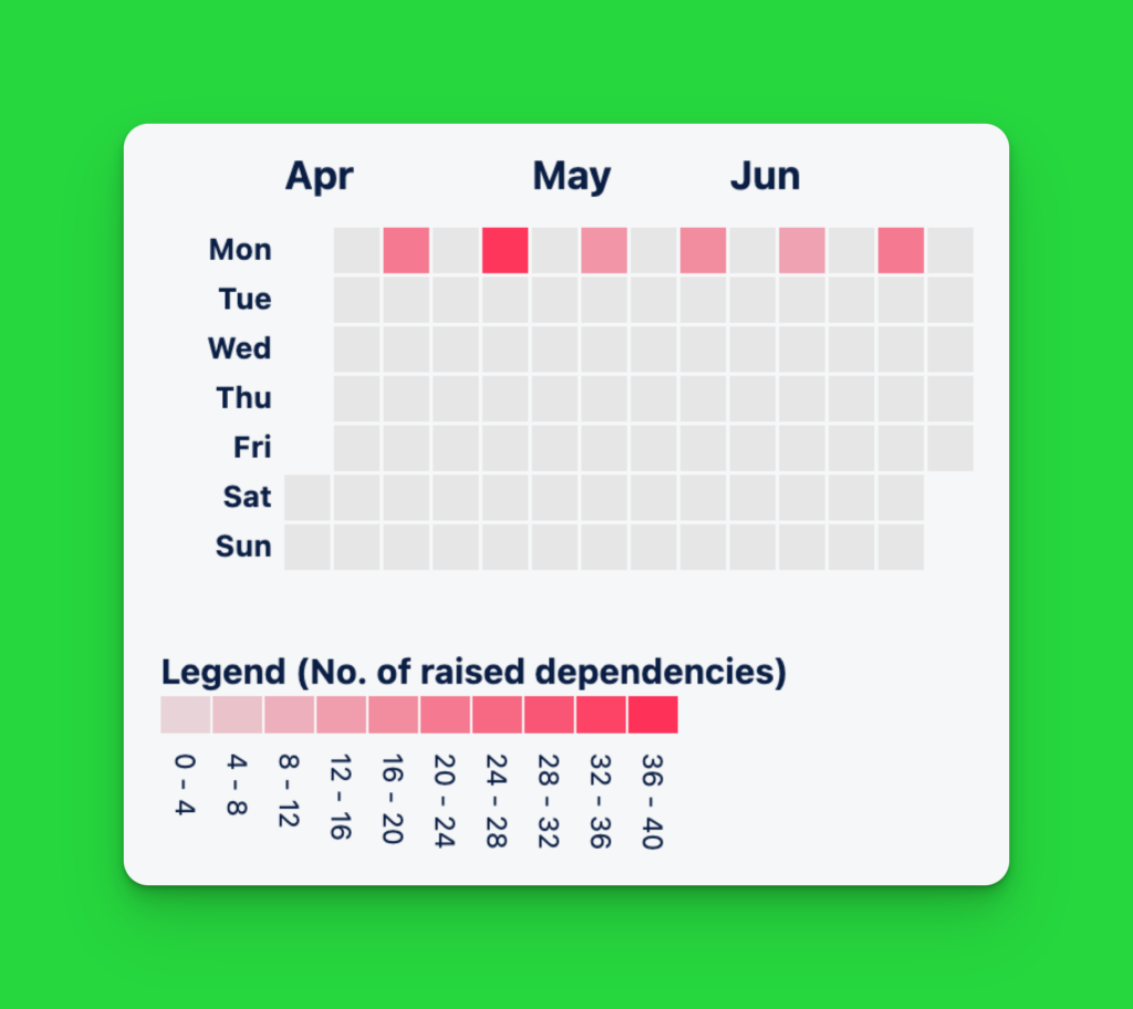
the dependency calendar view in Dependency Mapper for Jira
When it comes to visualising dependencies in Jira, two formats dominate: graph views and Gantt charts. Each serves a different purpose—and knowing when to use which is key to communicating clearly and managing risk.
Graph-based views show issues as nodes, with arrows representing relationships like “blocks” or “is caused by.” Think of it like a live map of your project’s architecture.
Use it when you need to:
Quickly spot blockers and bottlenecks
Understand cross-team or cross-project dependencies
Surface hidden risks during sprint or PI planning
Show how ideas, tasks, and reviews connect in real time
Best for: Delivery leads, team leads, and technical managers who need clarity over complexity.
Tools like Dependency Mapper for Jira are built exactly for this—fast, filterable, and lightweight enough to use live in a stand-up.
Gantt charts lay work out across a timeline. Dependencies appear as arrows between bars, showing sequencing and duration.
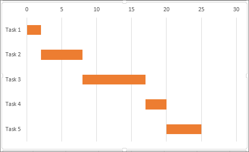
Use it when you need to:
Forecast delivery dates
Allocate resources across teams
Communicate schedules to non-technical stakeholders
Plan around milestones or deadlines
Best for: Project managers, execs, and enterprise stakeholders who need a high-level view of “when.”
Popular options include Jira Plans, Structure.Gantt, and Advanced Roadmaps.
Use Case | Graph View ✅ | Gantt Chart ✅ |
|---|---|---|
Spotting blockers fast | ✅ | ❌ |
Scheduling delivery | ❌ | ✅ |
Understanding team overlap | ✅ | ✅ |
Communicating to teams | ✅ | ❌ |
PI planning sessions | ✅ | only for small increments |
🔁 Most teams need both. Use graphs for structure. Use Gantt charts for timing.
Visualizing dependencies can unlock powerful insights—but only if the data behind the graph is clean, consistent, and understood. Here are the most common traps teams fall into (and how to avoid them).
If teams aren’t using issue links consistently, your dependency map will be incomplete—or worse, misleading. This often happens when:
Issue linking isn’t part of the standard workflow
Different teams use different link types or ignore them altogether
Teams are using different planning tools
Important relationships are captured in comments or a document like Confluence—not Jira
Fix it:
Standardise how and when to create links (e.g. “If an issue blocks another, always use ‘blocks’”). Consider automation to flag or enforce missing links. Consider deadlines for identifying dependencies.
Note: Dependency Mapper for Jira can be configured to show unlinked issues in a report
Creating too many custom link types, complex nesting, or deep initiative/epic/story layers can make your dependency graph harder to read than the backlog itself.
Fix it:
Stick to a small, meaningful set of link types. Keep hierarchy levels manageable. Your graph should highlight flow and blockers—not become another puzzle to solve.
Even the best visualization tools are useless if no one knows how to read or maintain them. If teams don’t understand what they’re looking at—or how to contribute—it won’t be trusted or used.
Fix it:
Train users on the “why” behind dependency mapping, not just the “how.” Use tools like Dependency Mapper for Jira that make the experience intuitive, not intimidating. Show live examples in sprint reviews or planning sessions.
A dependency graph is only as useful as the data feeding it. Keep it clean, keep it simple, and most importantly—make sure your team knows how to use it.
Yes — Dependency Mapper supports cross-project graphs out of the box. You can visualise relationships between issues from different Jira projects in one unified view, making it perfect for:
Cross-squad or cross-department planning
Multi-vendor delivery oversight
Program and portfolio-level coordination
Just apply the filters you need—by project, label, sprint, or link type—and Dependency Mapper does the rest.
Currently, Dependency Mapper for Jira is available on Jira Cloud and Data Center, with support for Jira Software and Jira Service Management projects. A free trial is available for 30 days.
Graphs update in real time based on your Jira data.
As soon as a link is added, removed, or changed—whether manually or via automation—the Dependency Mapper reflects that change immediately. There’s no need to rebuild or refresh the graph manually.
This makes it ideal for:
Live planning sessions
Real-time blocker tracking
Always-on stakeholder dashboards
🔁 Bonus: You can also embed graphs in Confluence or export them as PNGs for reporting or presentations.
Dependency mapping doesn’t need to be overwhelming—especially with the right partner.
Whether you’re just getting started with issue links, or you’re deep into PI planning and cross-project delivery, Quirk can help you:
Set up dependency graphs that work for your teams
Clean up messy link structures and standardise workflows
Choose the right tools for your environment (Cloud, Premium, or Marketplace Apps)
Train your teams to get value from the visualisation—not just data
We’ve helped agile squads, government agencies, and scaling SaaS companies transform how they deliver with Jira. Now it’s your turn.
👉 Book a free Jira consultation with Quirk
🔗 Or learn more about our Atlassian consulting services
Need something more specific? Reach out directly via our contact form — we’ll be in touch within one business day.